So I tried a little experiment. I had a vacant, icky old, '70s home, that instead of, as usual, doing the least amount of work to it using the least expensive Home Depot options, I decided to go with more modern up grades and see how things turned out from a business perspective. I did not want to go full granite-counter-tops-crazy, but stay more in the middle price range where, with a little bit of resourcefulness, you can get look that is fairly close to Restoration Hardware but with out the outrageous price tag.
I directed this project from my command center in California, while the work was being done in the wilds of Nebraska. This meant a 100 details were not addressed as I would have liked. Did it matter in the end…well we will see.
Here is the subject home. The property management company I had wanted to sell it off for a quick sale of $1,000 to whatever sadsack ambled along and was willing to call such a dump home. It is my experience that such people never have the resources or vision to do what needs to be done to the home and the home will just get uglier and uglier as time goes on. More times than not, their drug habit, or whatever else it is that is holding them at the bottom off society, flairs up, creates an untenable situation and I end up with a bigger mess then when I started.
Anyway, here is how it was:
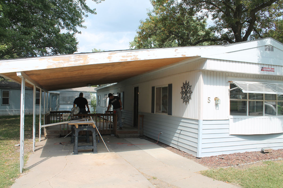
Not too bad, it has a nice carport. I worry about the weight of it, but its been there since the '80s.
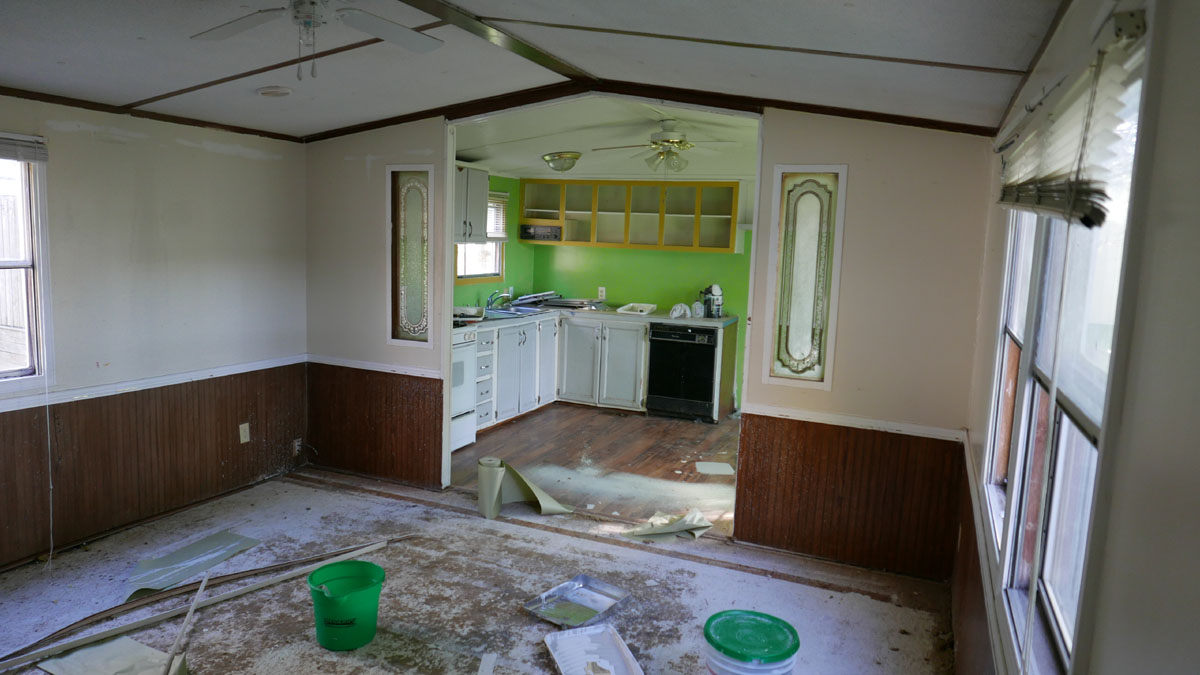
Typical ugly '70s mobile home kitchen. I am sure you have seen worst, but still it is pretty crappy even with a Leonardo da Vinci to class it up. That round counter top had me worried. I did not see how we could replace it with its odd angles without going to the expense of a custom shop. Nor does the shape lend itself to being tiled over.
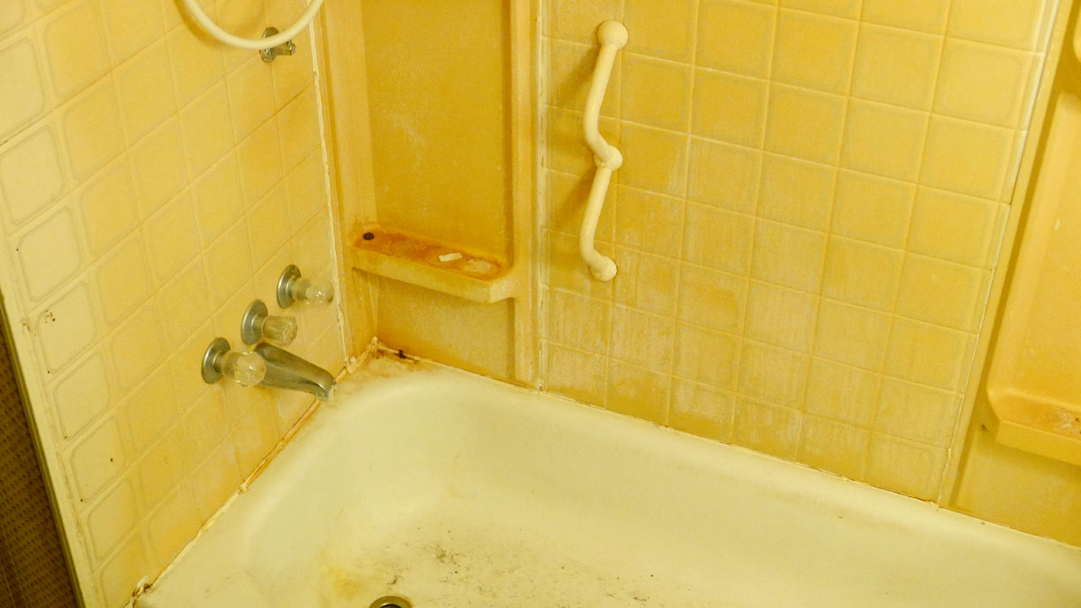
Again, not horrible, but about all I could see moving into this is someone who pretty much had given up on life.
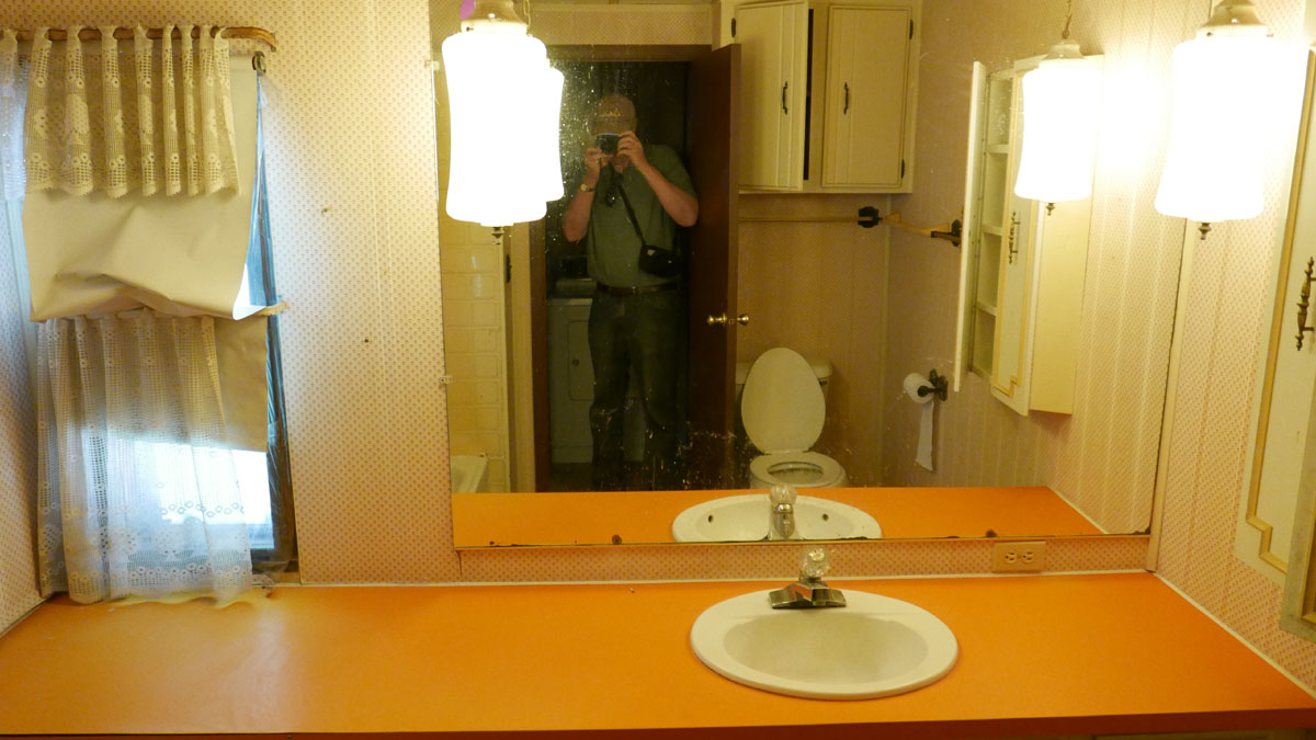
Nice! Who doesn’t like the color orange to brighten up his days.
I will save you from a shot of the toilet.
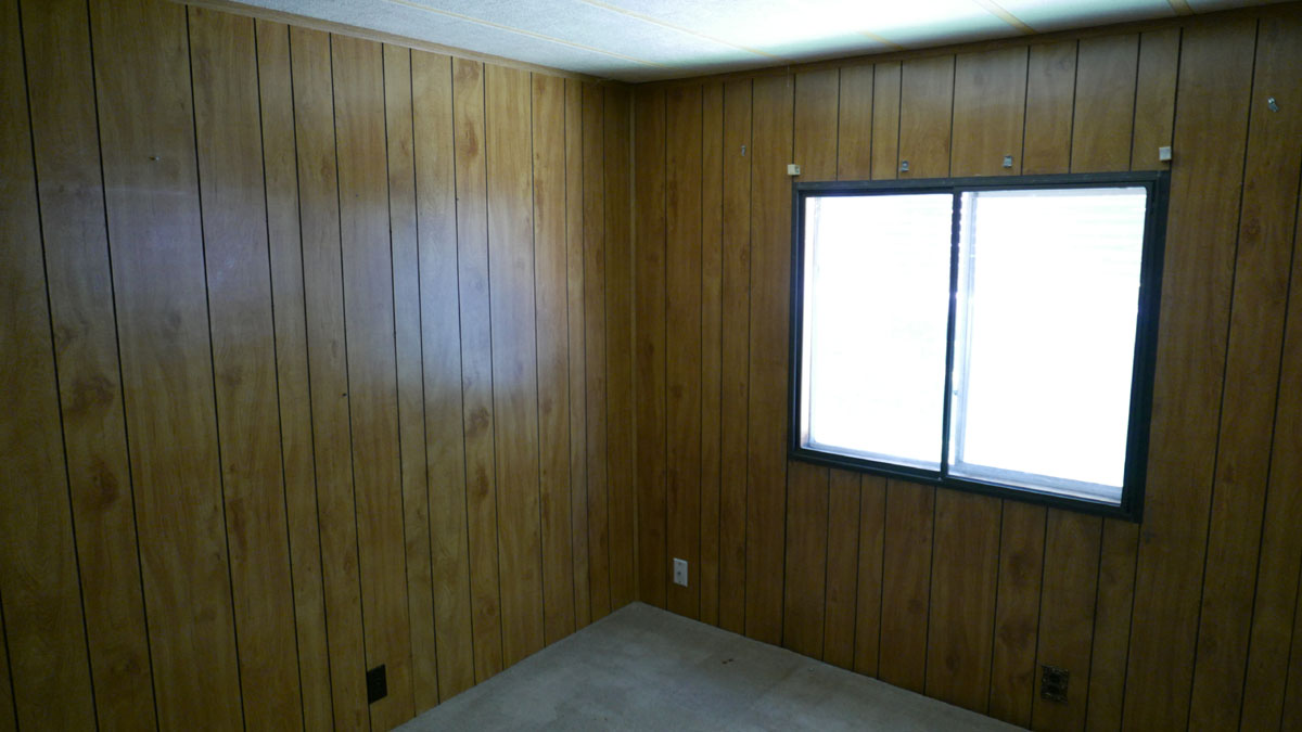
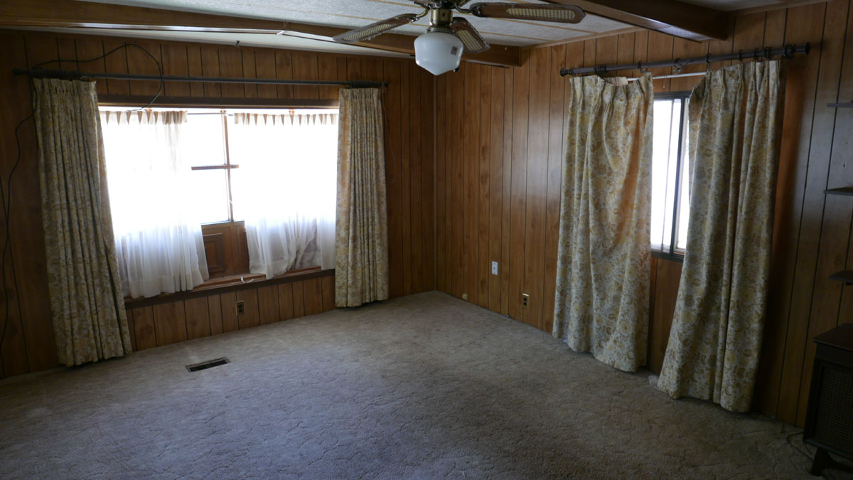
I am old enough to remember when this paneling was a fresh look and brought to mind a masculine den in a lord’s manor. Or something like that.
Not so much any more.
Actually this is in pretty good shape, but dark walls do not help a small room look bigger.
.
.
OK now for the reveal:
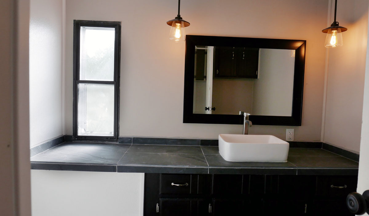
I had the guys put down slate for the vanity top and went with that style of sink for the contrast againt the dark slate and the fact that it helps pull the home out of the '70s. Same with the lights. They were about $65 each and the cheap ones with no style were about $30. The sink and faucet were about $100 more than the crappy ceramic ones I used to use in my apartments.
I found a paint that matches those stylish dark vanities that they sell in Home Depot these days and had the guys paint the crappy old vanity with it. Being dark like that, you really don’t see that it is an old one.
The mirror was from Bed Bath & Beyond. I think it was about $50. I don’t know why but they did not buy the one I told them to, which had little silver beads around the inside of the frame. It would have given it just a little more modern touch. My crew boss is pretty short which is why the mirror is so low on the wall.
If I had been there, the slate would have been darker as well as the grout and the nickle hardware would have had a super modern profile.
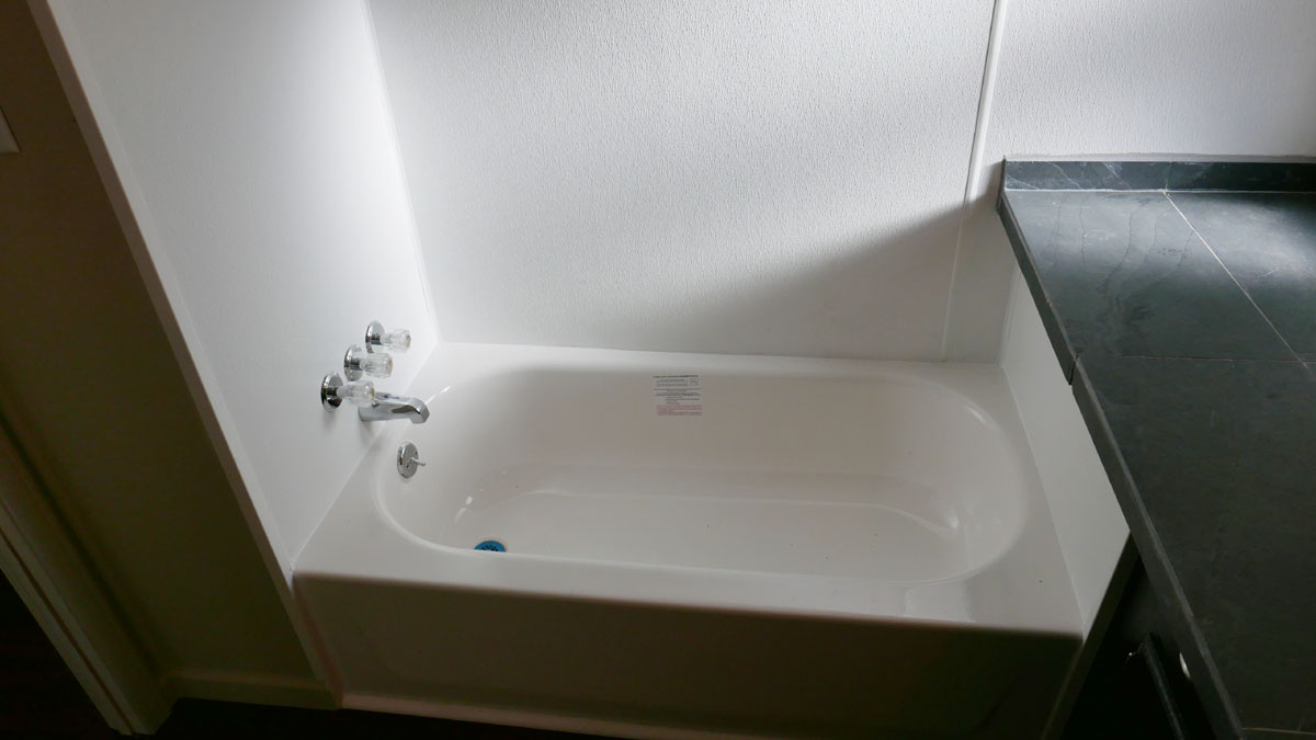
Again, had I been there, I would had gone with some more modern bath fixtures.
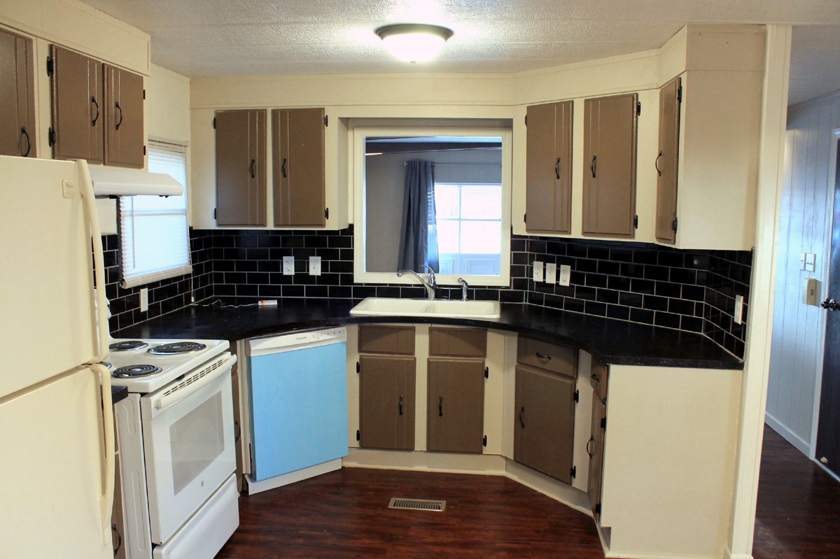
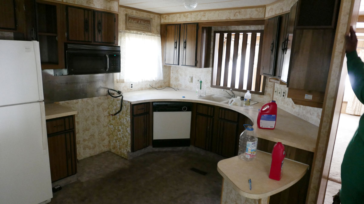
The two tone cabinets were done before I took control of the project. I really don’t like the look. I found a special paint for counter tops. It is a 3 step process and came out pretty well. I would use it again if faced with another situation where replacing the counter top is impractical.
I told the guys to leave the protective covers on the appliances so everyone will understand they are new.
The flooring was Cherry click flooring from Home Depot. Only the bedrooms got carpet.
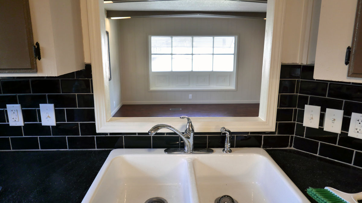
For only a $120 above the crappy alternatives, I found this sink that has an obvious sense of quality.
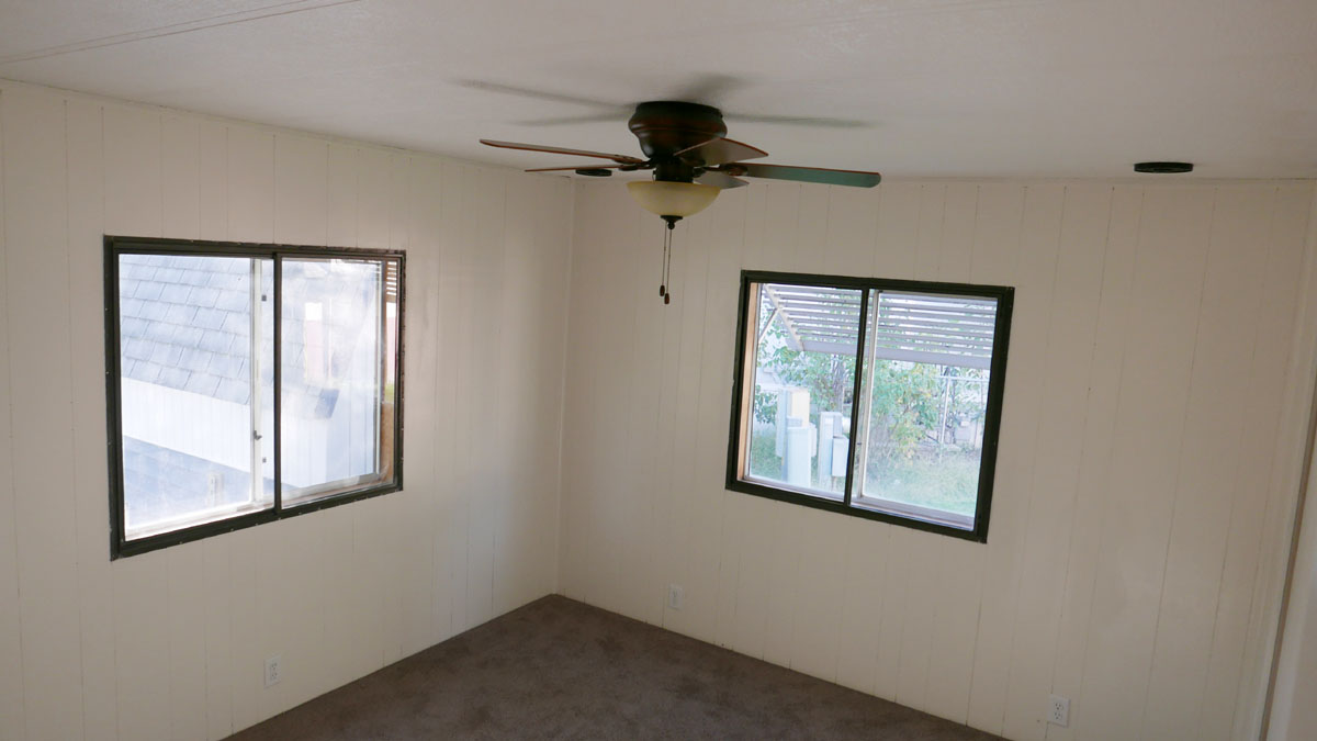
Lightening up the wall made a huge difference, though the guys said they had a heck of time painting the edges of the groves.
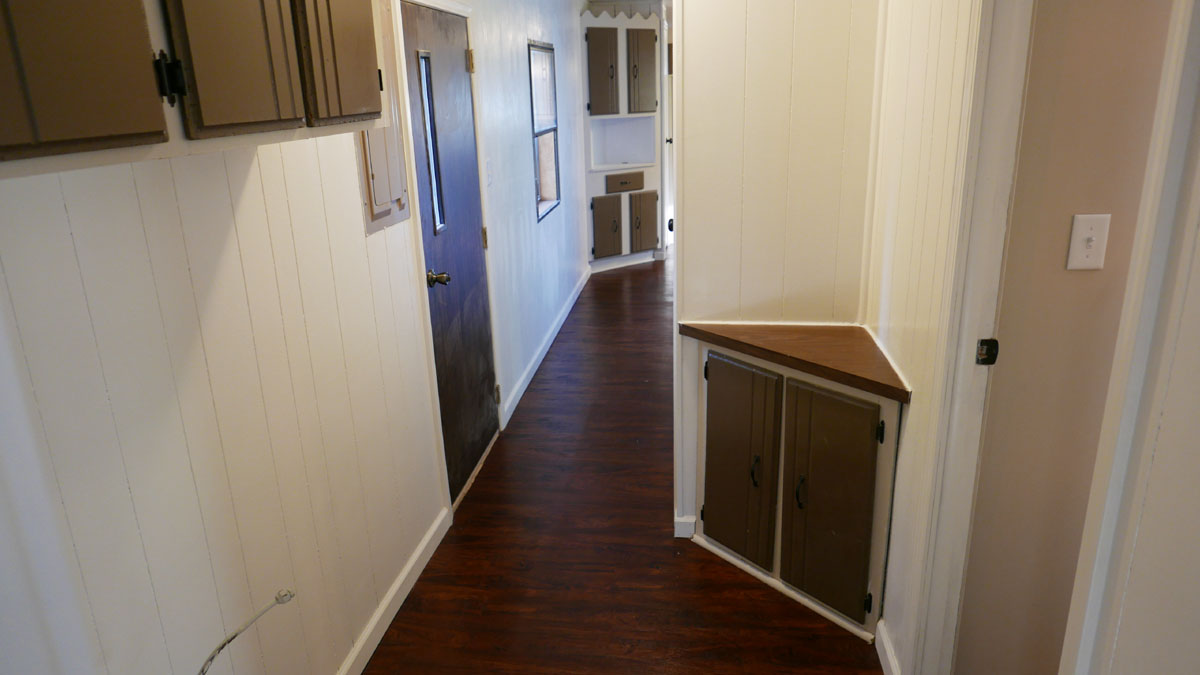
Here is a better look at the flooring. I told the guys to paint all the doors the same as the walls; makes the space feel larger. I see one got missed.
I really don’t like the two tone cabinet look.
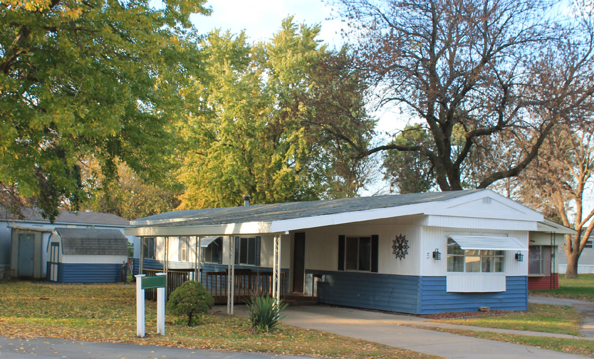
A paint job really freshened it up on the outside. I always use semigloss so it has a shiny new look. I hate flat paint. It marks and gets dirty too easily.
Here’s a tip for you: for residential real estate, only buy exterior light fixtures where the bulbs can be replaced without disassembling the fixtures. The ones that need to be disassembled don’t always get reassembled.
Now the numbers.
My goal was to get the home in good enough shape to go another 20 years and get a decent quality tenant in it. The whole project cost $13,000; I had to put in a new heater and water heater, which as you know, are made of gold. I figure if I went with the cheapest alternatives I would had saved about $1,000. But it would had felt much cheaper.
Everyone who saw it really liked it. I even found myself thinking I should keep it for me so I would have a cozy little home to stay in when I was out that way, which is just crazy. But it just had that feel to it, which does not come through in the photos. I put it on the market for $17,000; $2k down and ether plan A; $700/month no interest or plan B; $650/month at 5% interest. The lot rent of $310 is included. Oh, yeah, I should say it is a 2br 1ba, 1978, 14 footer.
It went fast and I had several people wanting it. In the end it was a young husband and wife that got it. They went for plan A. My theory regarding the $2k down will filter out the ne’er-do-wells who live lives of chaos and never work out in the long run. We shall see.